
Quilts have great visual appeal, due in part to the sense of rhythm in the pattern repeat.

The repeat of a block design sets up a beat.

It's not only the pattern that contributes to the rhythm, it's the intervals between the pattern---the negative space.

Colors we view as neutrals work well as intervals in the negative space.
Black or white is very effective.
kE9s4Z+lW-BRK+!VTMf!~~60_57.jpg)

Once you add color, texture and pattern to the intervals you get a different rhythm.

With busier intervals you get a more complex rhythm.

A more exciting rhythm

Perhaps tooooo exciting.

You could set up a calm versus chaos continuum.
And decide where you fit.

Perhaps the quilt above is too static for you.
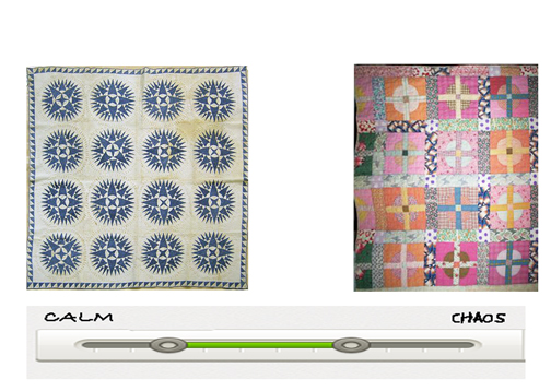
The calmest quilts have isolated designs in regular repeat with a cool neutral in the intervals.

The more pattern you add to the intervals the less calm the design

The scale of the pattern in the intervals also affects the rhythm.

You can increase the beat with a variety of prints

Until it's just too much.

Elsa Van Freytag---perhaps too much---but never dull.

You have to find your own rhythm.
I've been thinking a lot about design and quilts and I have several modern print reproduction collections for Moda on the horizon. Check out my new blog called:

Historically Modern Quilts
I'll do posts like this one about design, have a weekly Modern Print Monday and a monthly free pattern for needlework based on traditional modernism (an oxymoron!).